I've lived in NY for my whole life, I know good pizza. Dominos, eh, not good, but sometimes (when you are hungover maybe) you just crave it. I mean, its better than PIzzaHut, thats for sure, which apparently is because they use fresh, never frozen dough (did you know that?!).
There's a Dominos around the corner from my apartment, I have to walk past it everyday, at least twice a day. I can't help but admire the decals on the window. This store front is not worthy of the beautiful type treatments. The illustration they use on the boxes are far superior to the pizza.
Image / Roger Xavier
Apparently, I am not the first one to notice the great design Dominos has implemented. Underconsideration amongst others saw the design and fell in love as I did.
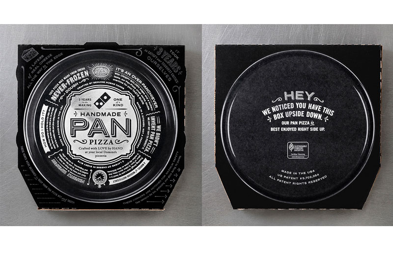
CP+B designed a box for Dominos to help them challenge the "signature" dish of PizzaHut, the Pan Pizza, exposing the dirty little secret, PizzaHut uses frozen dough.
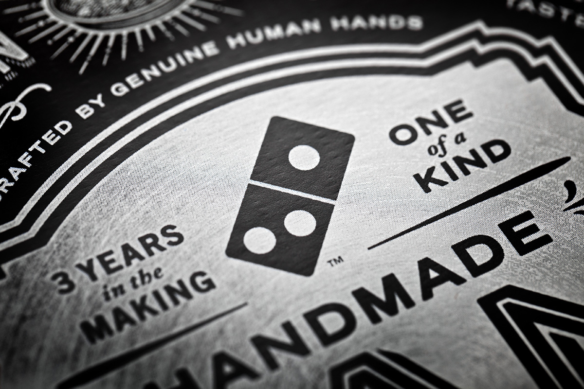
Ok, enough about the actual pizza, this is a design post, lets talk about the box. Its damn sexy. Black and white. Beautifully typeset, CP+B got it right.
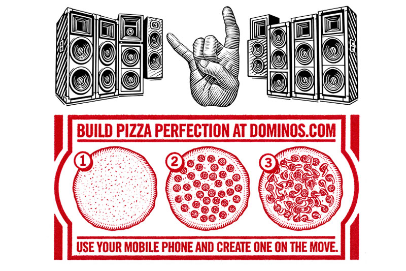
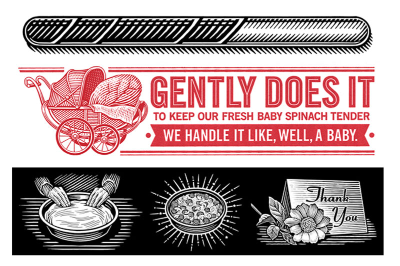
The illustrations by Roger Xavier truly express artisan and complete the design of the box to perfection.
Images / Roger Xavier
Roger did a series of spot illustrations for Dominos in his signature Scratchboard style that are absolutely beautiful. It is completely surprising to see such artfully done illustrations on Dominos boxes, but it is quite a lovely surprise. I may not love to eat Dominos regularly, but based on simply the art, I would choose them over PizzaHut any day.


