Steve Simpson / El Mariachi Red Wine Series
I have a serious crush on the work of Steve Simpson. Everywhere I turn I see it again and again! We took a look at his 7UP Wonderland Illustrations and were blown away. We checked out the work he did for Mic's Chili and could hardly contain ourselves. This time around, TheDieline.com gives us an in-depth look at the process behind the El Mariachi Red Wine Series and I am speechless. Check out the all the deets here.
Steve Simpson / 7UP Winterwonderland
I recently subscribed to Computer Arts, which I had been meaning to do for a while, and I regret having not done it sooner! I went to shelf the Dec 2012 issue and decided to give it another look, and realized I had a few post-it notes throughout. Illustrator Steve Simpson. Obsessed.
Steve Simpson was tasked with creating illustrations that were "Christmassy - but not too Chrismassy" for client, Pepsico. He was commissioned by Art Director Vince Lim. A trusting client / Art DIrection / Illustrator relationship allowed the concept to breathe and become what has won the silver metal at the Association of Illustrators' Images show (and of course be featured in Computer Arts!).
As a whole, the piece is enchanting. The time in the color palette creates a time in the evening which during the winter is like living in a movie. It's fun. It's interesting. It keeps you looking. This scene makes me wish I appreciated NYC more during the holidays. I want to run out and snatch-me-up a pair of ice skates, some ear-muffs and a hot cocoa! I just wish when I get to the ice, lay down on my back, in the snow, John Cusack shows up and we wind up together. Swoon.
All images vincelim.com
You are brought in and see all the interesting characters that fill the scene. The simple color palette, loosely inspired by 7UP's red, green and white color palette, intensifies the scene at both a distance and up close. The detail is incredible and certainly is worthy of any award.
Dominos Pizza Design
I've lived in NY for my whole life, I know good pizza. Dominos, eh, not good, but sometimes (when you are hungover maybe) you just crave it. I mean, its better than PIzzaHut, thats for sure, which apparently is because they use fresh, never frozen dough (did you know that?!).
There's a Dominos around the corner from my apartment, I have to walk past it everyday, at least twice a day. I can't help but admire the decals on the window. This store front is not worthy of the beautiful type treatments. The illustration they use on the boxes are far superior to the pizza.
Image / Roger Xavier
Apparently, I am not the first one to notice the great design Dominos has implemented. Underconsideration amongst others saw the design and fell in love as I did.
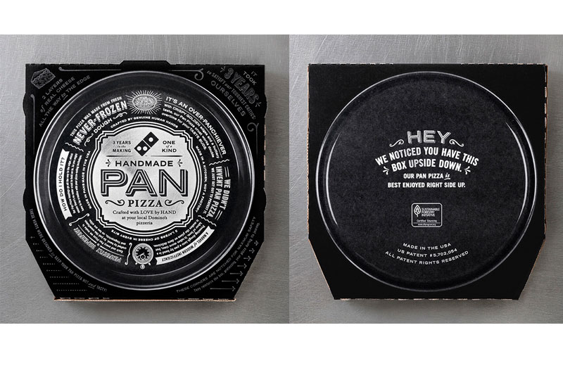
CP+B designed a box for Dominos to help them challenge the "signature" dish of PizzaHut, the Pan Pizza, exposing the dirty little secret, PizzaHut uses frozen dough.
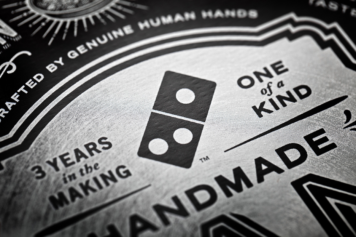
Ok, enough about the actual pizza, this is a design post, lets talk about the box. Its damn sexy. Black and white. Beautifully typeset, CP+B got it right.
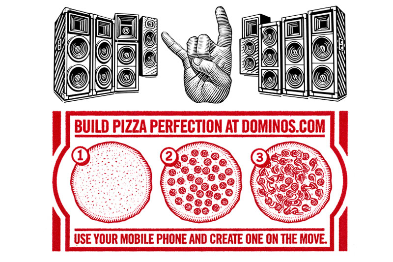
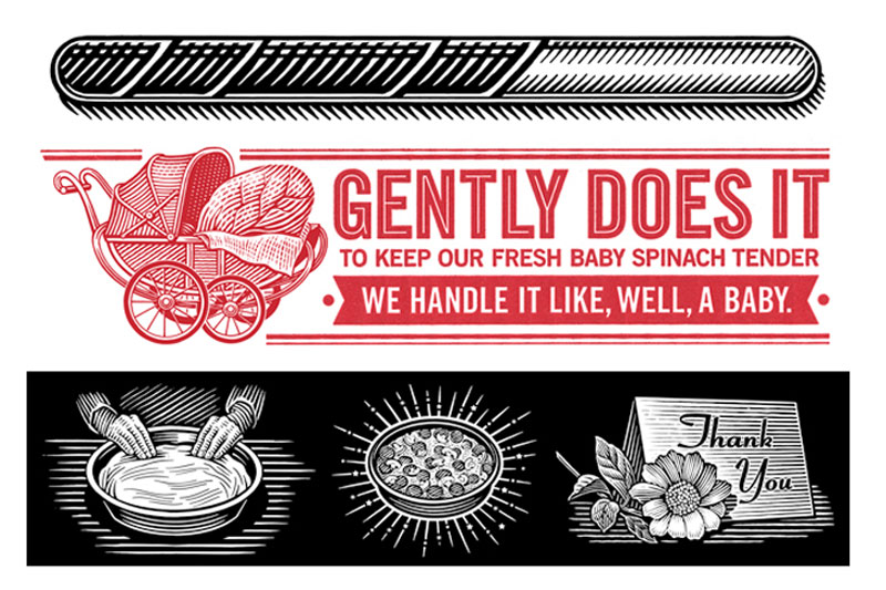
The illustrations by Roger Xavier truly express artisan and complete the design of the box to perfection.
Images / Roger Xavier
Roger did a series of spot illustrations for Dominos in his signature Scratchboard style that are absolutely beautiful. It is completely surprising to see such artfully done illustrations on Dominos boxes, but it is quite a lovely surprise. I may not love to eat Dominos regularly, but based on simply the art, I would choose them over PizzaHut any day.


