Steve Simpson / El Mariachi Red Wine Series
I have a serious crush on the work of Steve Simpson. Everywhere I turn I see it again and again! We took a look at his 7UP Wonderland Illustrations and were blown away. We checked out the work he did for Mic's Chili and could hardly contain ourselves. This time around, TheDieline.com gives us an in-depth look at the process behind the El Mariachi Red Wine Series and I am speechless. Check out the all the deets here.
Alt Speaker / Stephanie Housley : Coral & Tusk
My head is still spinning from attending AltSummit. I was throw back into "real life" and work, but all I want to do is concentrate on this blog! I have a lot of work to do, and notes to review from all I learned at Alt and will be posting a thorough recap next week, for now take a peek at my gal Heather's recap, she did a fantastic job of summing it all up!
The quality of speakers at Alt is really incredible, they know no boundaries when booking the right people! One of the speakers that I loved looking into after Alt was Stephanie Housley. Stephanie was such an inspiration. As someone that works full time while trying to blog and start a business, I find it tiring & trying & challenging, but listening to Stephanie and seeing what she accomplished in starting Coral & Tusk, she makes me see that hard work and dedication pays off. She too was working while launching a business and has accomplished so much. Her tale of working overseas for her full-time gig, and creating her beautiul drawings and products (by hand at first, wowza!) is truly what I needed to hear to get some fire under my own tush.
via Coral & Tusk / photography by Kate Lacey
Stephanie Housley founded Coral & Tusk in 2007 with her husband Chris Lacinak. Stephanies quirky designs and characters are first drawn by hand before redrawn STITCH BY STITCH on the computer. Coral and Tusk now has a gorgeous space in Brooklyn that not only acts as her showroom, but is where the gorgeous products are finished BY HAND.
images via Coral & Tusk
As an illustrator, I love to take in the many unique, incredible styles of work that are out there. Stephanie's work REALLY blows me away. Her characters are clever and adorable.
I have alawys wanted to create an illustrated alphabet, but not been able to decide what style I'd like to do them in and how to set mine out from the other incredible alphabets out there, but Stephanie really takes the cake. Look at that Anteater above! Perfection.
images via Coral & Tusk
images via Coral & Tusk
“A mix of smart design, magic and mischief is at the heart of every Coral & Tusk embroidery.” - Coral & Husk
images via Coral & Tusk
My A#1FAVE is this Plains Fox Pocket Pillow. It is clear the level of thought and work that went into this darling. I mean, the fox comes out of the tee-pee. WHOA. I have got to get my hands on some of her work, I think I'll try to get to the Brooklyn Studio! SWOON.
Local Artist : NOLA / The Magpie Collections
This week's design post is a little different than the usual. Sticking with the New Orleans posts (I've got so much more to show you!) I wanted to highlight a local artist that I met while I was away.
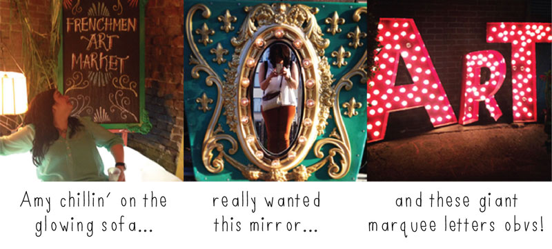
We were wandering down Frenchman Street, because that is where EVERYONE we spoke to said to go at night, and we came across this ADORABLE market, the Frenchman Art Market. It was a nighttime market with local artists selling their work.
When I'm away, I try to always buy a piece of jewelry. It can be costume or dress, don't matter, just something that when I wear it it reminds me of the trip... SOOOO ... when we stumbled upon this market it was a perfect storm! They had tons local artists products, and TONS of jewelry.
Lauren Noel King of The Magpie Collections had BEAUTIFUL, unique, handmade jewelry. Because it was just after my birthday, my ladies said they wanted to buy me something on our trip as my gift (score!), and there was no questions I was getting something from The Magpie Collection. The decision was a difficult one, I mean, check out all the cool stuff she has in her Etsy store!
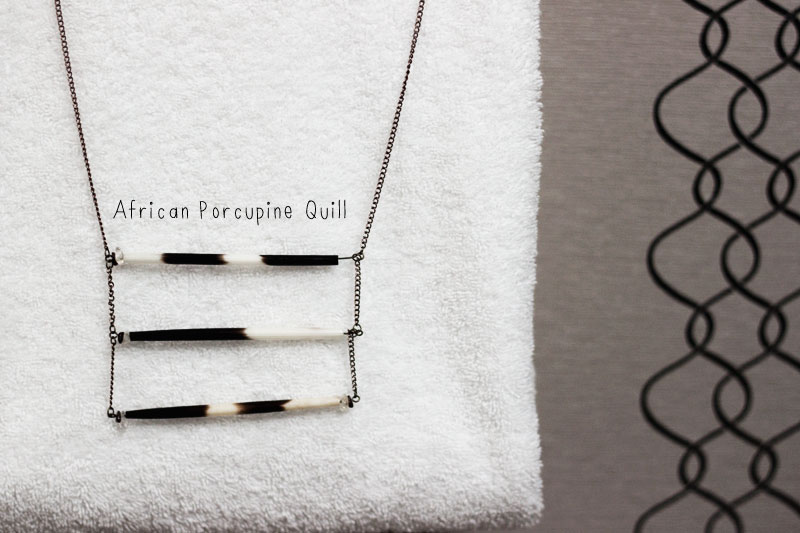
I decided on an African Porcupine Quill necklace. (You can see some better pictures and description of a similar one in her shop here.) Not only was her work great, Lauren was adorable and sooo sweet. Her business card is this blue sparkly piece of goodness, and she told me to contact her at any time if I have any issues with the necklace.
I went with a more simple design because I like to have pieces that I can wear everyday, but I LOVED this one too.
This night was beyond perfect. We started at The Spotted Cat and listened to Kristina Morales and the Bayou Shufflers for a looooong time. She (THEY) are amazing, check them out! I fell in love with the trombone player and then we stumbled upon the Frenchmen Market!
The space was soooooo coooolllll. There were different interesting sitting areas, including a GLOWING sofa! I'm uber sad I didn't get this mirror, but really, how the hell would I have gotten it home?!
While I write this, I am actually away in Vancouver for work and I realized that I actually have the necklace with me! I like to keep the jewelry situation light when I travel, I stick to the basics that I love and would wear while home on the reg (unless there is a specific piece that makes an outfit of course!). Pictured above we have the gorgeous NOLA necklace I can't stop talking about, a ring that I bought on my first business trip to Arizona at vingage shop (over 4 years ago!) and my favorite piece that reminds me of home. My grandpa Al had a business and had this watch face made SOOO LONG AGO. My mama found it at her house and gave it to me this year, I don't leave home without it!
Do you pick up trinkets along while away to remind you of your trip? I've collected quite a lot of interesting items, maybe I'll share the whole collection with you one day soon!
New Orleans here I come!
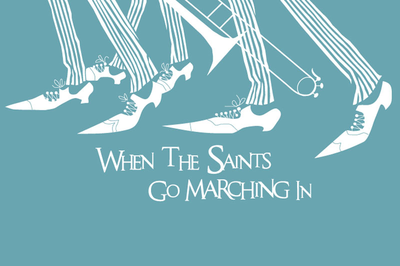
I am in New Orleans and loving ever second of it. The Food. The music. The people. ALL OF IT. These simple poster designs are amazing and needed to be shared. I cannot wait to tell you all about everything we do and see and eat!
Design Inspiration April 1 2013
Today marks the first day or April, which means it's the last month of me being 27. Yes, you heard me correctly, I am turning 28 this month (on the 18th to be exact). I'm not one to complain about growing older, but 28 seems like I am entering adulthood. Well, I know I TECHNICALLY AM an adult, but 28 really is coming for me.
Over the past year, being 27, I have been happy. I started the blog, I have a job I love, friends I can't picture my life without, a wonderful family, and overall a good life, but nothing is perfect and there is always room for improvement. There have been several let downs over the past year, and I have identified some things that need to be changed, which I will be sharing with you over the course of the next year.
This month I will be setting some goals, not only for the blog, but for 28. I've decided 28 is my year, and "saying it out loud" to you means I have to stick to the changes. I am establishing and developing some great new regular posts for you, which I think you will be as excited as I am about!
Today I baked some of the most challenging and beautiful cupcakes I have ever made, which I will of course be sharing with you, and I am exhausted, but feeling inspired. Here are some things that are inspiring me today.
I am fortunate in that I DO make something pretty much everyday, but I think I need to head back to basics and create some personal projects with my hands. I think to step away from work and the blog and the computer will be good for me- and I'm not just talking the DIY and baking stuff, I mean some design work, some illustration, remind myself why I fell in love with it all to begin with. Paint? Cutout? Glue? SURE! You should also make something today.
Speaking of back to basics, I am loving some of these simplistic logos, posters and designs I am seeing on the web. Who said we have to over design. Thoughtful design. Back to basics, that's what I'm talking about.
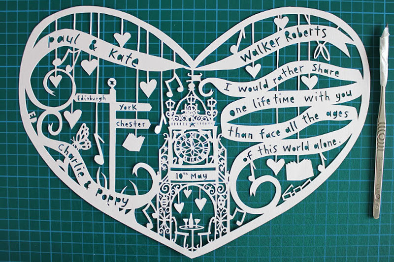
I am obsessed with this. Emma Daniels makes some RIDICULOUS custom cutouts. Now, I don't think I am gentle and meticulous enough for something like this, but the idea of it is inspiring and CRAZY.
I went to college for illustration, which I LOVE and I am think will always be my core, so when I see something like this which is so well designed, and well illustrated and thought out ... SWOON. This piece is particularly inspiring because it's EVERYTHING and so simple and well done. This piece reminds me to think outside the box and just go for it, but also that using what you know best can really surprise even yourself.
... and let us not forget baking. I baked my arse off today, and it was challenging, and frustrating, and some of my best work and some not so good, but I have to remember to continue to push myself and try new things. I am also going to try to reallllly learn about baking. Yeah, I do it, and it works (most of the time) but I'd like to study it more (a class maybe?) and get the basics down a bit more so I have more to share with ya'll! Scones is on the list of something to try, so I will be turning to Smitten Kitchen for some pointers, she's freakin' ace.
So there's what inspiring me in the start of April. April will be about getting back to basics and pushing myself. I have a few weeks until my bday, and plan on spending them setting goals, for the weeks, months and year ahead. What are some of your goals this month?
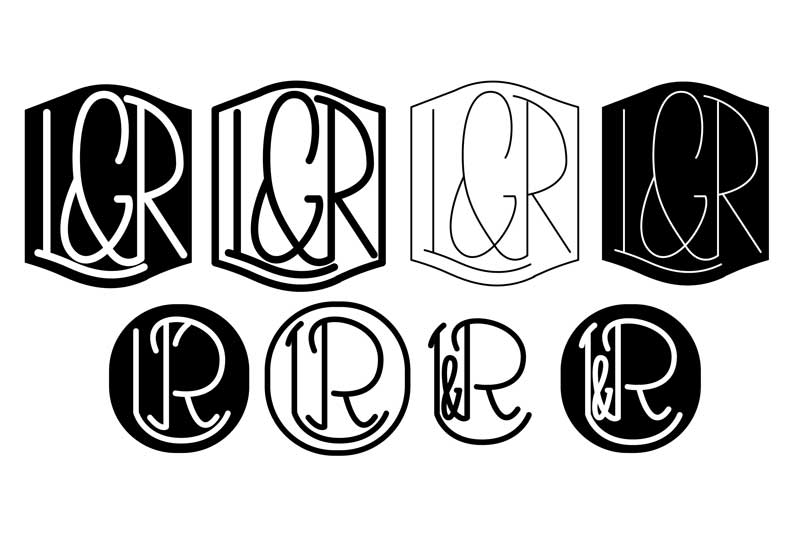
L&R Monogram for the best couple I know.
Two of my friends are getting married. They are the best. THE. BEST. I love them separately, but I LOVE them even more together. Let's back up a minute, these two friends and I all grew up in the same town on Long Island, but they didn't meet until adulthood (although I knew them both as kids). Amaze-balls. I have known them for what seems like forever. Their wedding will probably be the best wedding I will ever attend. Their love will probably be the strongest I ever see.
When they asked me if I would design a monogram for them, I jumped at the opportunity, I feel honored to be a part of their wedding, and this monogram will be with them forever (I see towels in their future). Here's the thing though Ladies and Gents, the letters are L and R. Think about that for a minute. An "L"...? Not the best (Sorry Jason, it's just not!).
I asked them to show me some examples of what they wanted, and some were circular.....
So here is what came to me first, based on the inspiration they gave me. I stepped away from the computer for this project. I often sketch a general look, but this time I wanted to do all the design work the old school way, just a pencil and some paper, and then scan them in. Well, although we liked this, they wanted it strong and masculine. Hmm. Well.... this ain't gonna work for the masculine request huh....
With the new direction, I tried to work on some more angular letters, but keeping in a circle. I decided to help fill the shape and balance everything out, and ampersand was going to be a must (I know, woe is me, I HAD to design ampersands - um yay!).
We really like these a lot, and they were definitely a contender, but can you read it? (Honestly...) So we decided to keep going...
Keeping with the smoooooooth lines of a circle, I whipped these up (which may be my personal faves), but they aren't really what they were looking for. MASCULINE. THINK MASCULINE JAMIE!!!
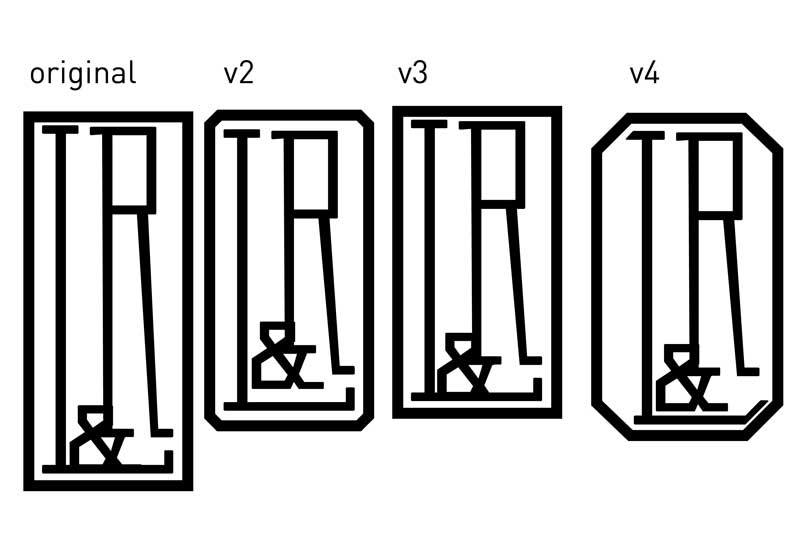
ALRIGHT, WE'RE GETTING SOMEWHERE NOW. As always, even when the client is your friend, you have to show them what they want to see (he wanted to see circles and masculine lines and...) thennnn he requested an octagon. Hmmm.... Now that was an interesting direction. The letters were still contained in a shape, but it was angular and sexy- the struggle though, how to fit a "L" in a dang octagon? Soooo I worked off the ampersand... I was digging this one, but the fact that the amp is before the L... not everyone was feelin' it. So, back to basics I go... what about a freakin' rectangle? It works well with the L AND the R...
So here we are now. We have decided that the rectangular one was THE ONE, but maybe it was a bit tooooo tall... and maybe it needed an angled corner (I did v4 to show him, but we agree its blegh). They need a bit of tweaking, but looks like v2 and v3 are the last ones standing.
I am working on their engagement party invitation now, which will be the first application of the monogram, and I am so excited to see what else they will be using it on!- I'll share with you along the way!
Which is your favorite?
Obsessed with #PantonePairings
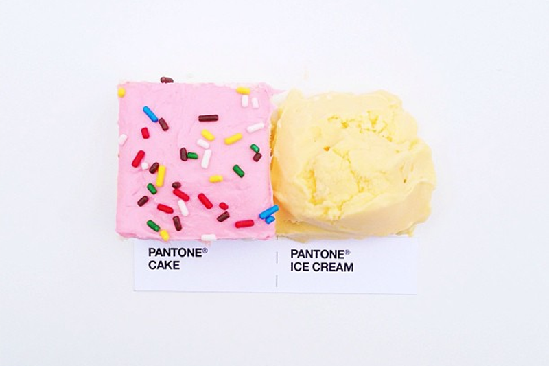
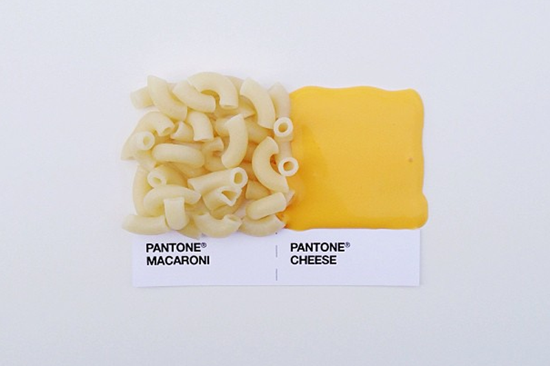
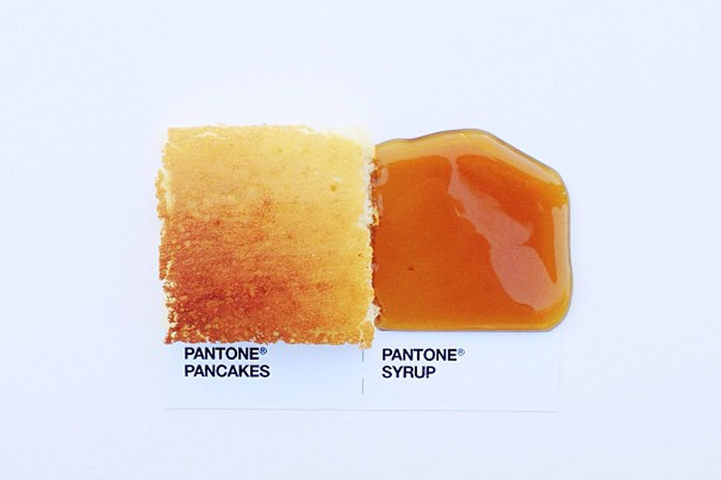
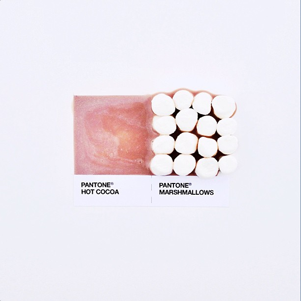
You all know me pretty well by now, so it shouldn't be hard to believe that I am COMPLETELY OBSESSED with #PantonePairings by David Schwen. Schwen, Minneapolis based art director totally nails it everytime.
“As a designer, you’re constantly picking color chips and pairing them up with one another. A while back I had an idea of making Pantone chips out of real household objects—sponges, cardboard, and the like. But while I was finishing up a poster design, I had taped two Pantone chips together to see how they looked next to one another. Instantly I thought of how people pair food together, and that was that. Pantone pairings.”
Follow along on Instagram via hasttag PantonePairings.
I am so kicking my self in the arse that I didn't think of this first, but I am glad Scwen did. Keep an eye out, he's got prints coming soon! Which will you buy?
Society 6 / My search for a new iPhone Case
Ho-Hum, last week I dropped my iPhone 4 and it had to go buh-bye. Although I had known that I was going to get a 5 soon (I mean, I did order Everpurse for a 5 when I had a 4) I wasn't ready just yet, I was on my way out from work and was going to by a new purse (#FAIL because I couldn't justify buying a bag when I knew I had to buy a phone). On the plus side, I have a new phone (yay), BUT what happens to your phone accessories when you get a new phone? I have had book iPhone cases, wood iPhone cases, this book iPhone dock - you name it, I think I have owned it!
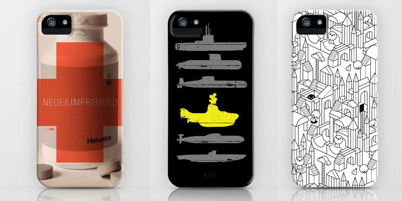
Most recently, I bought the Pantone Universe 418 (my bday!) case, and I have had the No. 2 case above - so my natural instinct would have been to get the Ampersand by the same artist (I have been eyeing that baby for a while) or another Pantone case (the Pantomime Vegan Power is kind of awesome)- but have you seen all the cases on Society6?! I spent most of my Sunday evening looking through and here are some of my favs- you have to help me choose!
Who doesn't love some Helvetica? - I kind of lurve this Neue&Impreuved case. The designer in me says YES! buttttt- YELLOW SUBMARINE? 128johnst is named after the address of my Aunt K. who was beyond obsessed with the Beatles, and my background hasn't been anything but a Beatles image since she passed soooo.... but then l saw this adorable Little Escher's Building Blocks! So simple and well done!
Of course the baker in me liked this cupcake one, but it wasn't my fave, so I am counting it out. While we are in the food category, I love this Simply Grotesk by Tom Davie. I love Tom Davies work in general, and he has a bunch of stuff on Society6 apparently, so to combine the my loves for design and food, I think this one is leading the pack so far. I kind of am feelin' the Distracted on the right, its simple and graphic but oh-so-right! (See what I mean, how do you chooooose?!)
Ya'll know I am into pattern. All-Day-Er-Day-Pattern, so when I saw some of these beauts I fell hard. Native Song, Bulgarian Rhapsody and DG Aztec have me swooning, hard.
BUT WE DIDN'T EVEN TALK ABOUT THE HAND WRITING ONES YET! The Hakuna Matata is a combo of pattern AND hadwriting, I think she takes the lead... but holey-moles, look at those other, simple, B&W, handwriting options. The F perfect and Beautiful Things really are making this decision difficult on me!
So whats the leader from this bunch? I just can't decide! Help!
Steve Simpson / Mic's Chilli
So, I am clearly in love with Steve Simpson, even though we haven't ever met. I was flipping though the Feb issue of Computer Arts and saw these amazing images created for Inferno Chili, and guess who created them, STEVE. I already shared his work here last month but I need to show you more!
Steve was hired by start up chilli brand, Mic's, to create the branding for their line of high-end chilli sauces. In Computer Arts, Steve talks about the project, saying that he "wanted to create a character that has immediate appeal; a little funky but with a serious side." He goes on to talk about how when you create a character that associated with the branding of a product, you have to create something that will stand the test of time, something which I think he definitely succeeded in.
He started working with the company in the early stages, which enabled him to have a bit of freedom, and now have to adhere to any brand guidelines (who does't LOVE that?!). With 6 different flavors, the bottles are all special in their own way, with a similar design, but different characters and colors- and way different than any other hot sauce you would see on the shelf, I'd buy it simply for the damn design!
Continuum did a great job incorporating the style of illustration into Mic's site as well, using the color palette and spot illustrations perfectly. Swoon. I love hot sauce. I love Steve. I love it all.
Sometimes blogging gets... MESSY.
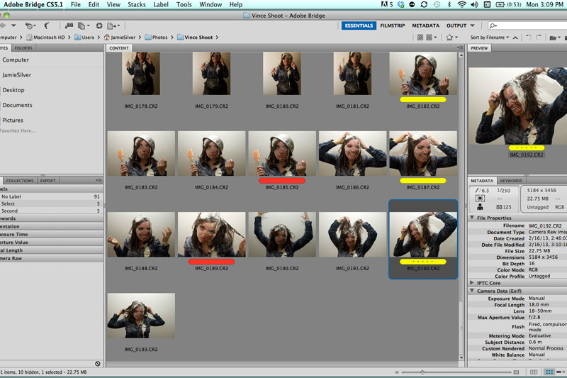
For a while now, I've wanted to get some shots done of me. I am not super comfortable getting my picture taken, so I wanted to work with someone I know and love and would let loose with, so I turned to a one of my best pals, Vince Perretti. He is amazing, and has does some photos here before. We were taught at The Blogcademy to practice your bloggerface so thats exactly what I did. Lets face it, bloggers and celebs always look sooooo perfect, and I've got to be honest, sometimes it gets messy, so we decided to get realz with it and show who I really am. A mess in the kitchen (just ask my roommates).
Couch moved, garbage bags on the floor, and an audience to witness it all, we got started. About 100 pictures later (and a few beers to loosen me up) we got it, a perfect representation of 128 john st. We kept it out of the kitchen, and shot on a white background intentionally, we didn't just want cutesy baking shots, we wanted a well designed concept planned out to perfection (well, as far as you can plan throwing flour and eggs at someone).
The plan was to add ingredients as we got into the shoot, just like you would when working on a recipe. Starting simple, we thought about what you do when you actually bake. Well, cream the butter, then add flour, no? So here we go, spreading butter on my face and throwing flour right on top. Eh. Not the best. Then how about adding the chocolate. OK, we were getting there.
Not all the shots were pretty, but they were all fun. I do think that our friend Steve got the most pleasure out of the whole shoot, he got to smash the eggs on my head. A bit angry are we Steve?
ok- maybe I had a bit of fun too....
... alright, fine, maybe a lot of fun.
After we knew we got a bunch of great ones for me to choose from, I decided to end it right, with the whole bowl of batter on my head, and I am so glad I did, I LOVE THIS SHOT.
I knew this was going to be messy, but I didn't know how far we would take it (as far as it could go it turns out). So thats me, just a girl in flannel making a mess in the kitchen. Special thanks to Vince for letting me destroy his apartment and for being able to understand my vision and take some amazing shots.
Which is your favorite, I just can't decide!


