I have a serious crush on the work of Steve Simpson. Everywhere I turn I see it again and again! We took a look at his 7UP Wonderland Illustrations and were blown away. We checked out the work he did for Mic's Chili and could hardly contain ourselves. This time around, TheDieline.com gives us an in-depth look at the process behind the El Mariachi Red Wine Series and I am speechless. Check out the all the deets here.
L&R Monogram for the best couple I know.
Two of my friends are getting married. They are the best. THE. BEST. I love them separately, but I LOVE them even more together. Let's back up a minute, these two friends and I all grew up in the same town on Long Island, but they didn't meet until adulthood (although I knew them both as kids). Amaze-balls. I have known them for what seems like forever. Their wedding will probably be the best wedding I will ever attend. Their love will probably be the strongest I ever see.
When they asked me if I would design a monogram for them, I jumped at the opportunity, I feel honored to be a part of their wedding, and this monogram will be with them forever (I see towels in their future). Here's the thing though Ladies and Gents, the letters are L and R. Think about that for a minute. An "L"...? Not the best (Sorry Jason, it's just not!).
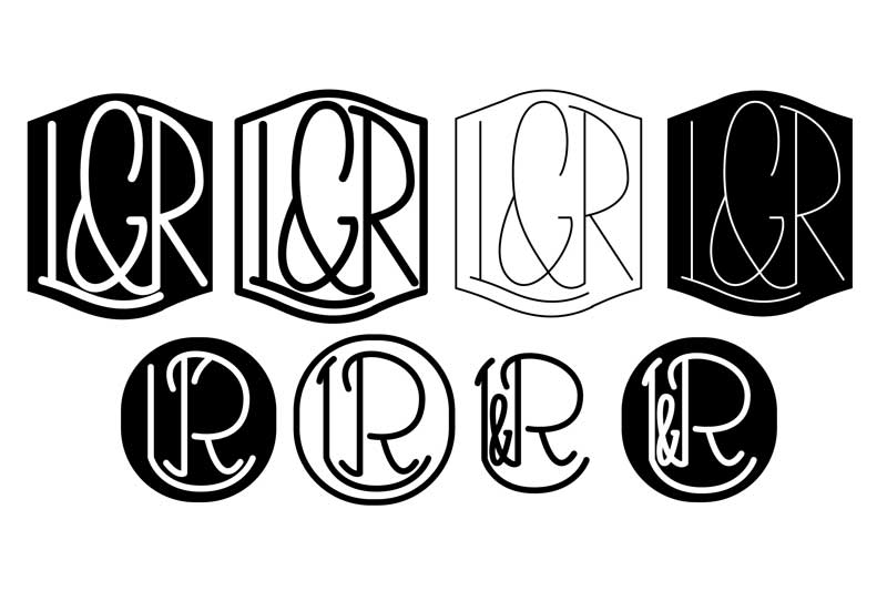
I asked them to show me some examples of what they wanted, and some were circular.....
So here is what came to me first, based on the inspiration they gave me. I stepped away from the computer for this project. I often sketch a general look, but this time I wanted to do all the design work the old school way, just a pencil and some paper, and then scan them in. Well, although we liked this, they wanted it strong and masculine. Hmm. Well.... this ain't gonna work for the masculine request huh....
With the new direction, I tried to work on some more angular letters, but keeping in a circle. I decided to help fill the shape and balance everything out, and ampersand was going to be a must (I know, woe is me, I HAD to design ampersands - um yay!).
We really like these a lot, and they were definitely a contender, but can you read it? (Honestly...) So we decided to keep going...
Keeping with the smoooooooth lines of a circle, I whipped these up (which may be my personal faves), but they aren't really what they were looking for. MASCULINE. THINK MASCULINE JAMIE!!!
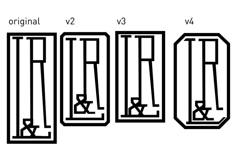
ALRIGHT, WE'RE GETTING SOMEWHERE NOW. As always, even when the client is your friend, you have to show them what they want to see (he wanted to see circles and masculine lines and...) thennnn he requested an octagon. Hmmm.... Now that was an interesting direction. The letters were still contained in a shape, but it was angular and sexy- the struggle though, how to fit a "L" in a dang octagon? Soooo I worked off the ampersand... I was digging this one, but the fact that the amp is before the L... not everyone was feelin' it. So, back to basics I go... what about a freakin' rectangle? It works well with the L AND the R...
So here we are now. We have decided that the rectangular one was THE ONE, but maybe it was a bit tooooo tall... and maybe it needed an angled corner (I did v4 to show him, but we agree its blegh). They need a bit of tweaking, but looks like v2 and v3 are the last ones standing.
I am working on their engagement party invitation now, which will be the first application of the monogram, and I am so excited to see what else they will be using it on!- I'll share with you along the way!
Which is your favorite?
NYC Sightseeing Brochure Part 1
In early 2011 a friend mentioned that someone he knew was looking for a designer, and asked if he could pass along my info. (Argh not this again!) Not all situations like this work out well (ie- ohheyyyy can you do stuff for me for free?). BUT this was different. This was intriguing. This was exciting. This... this... this was awesome. A sightseeing company in NYC needed some concepts and mockups of different brochures for different brands. Awesome. I love design. I love NYC. I want to do this!
It was my worst nightmare and favorite kind of project at the same time. Very little direction. Very little time. Go nuts, Go crazy. Do amazing. Five different concepts. Some serious and for an older crowd. Some "hip" and for a younger group. And GO.
Detail from one of the concepts.
Detail from another concept.
At the time, I was really into puzzling together different styles of type and blocking them together., which worked well with some of the different brochures I was working on, there was a lot to talk about and list. So much to see in NYC. So much to do...
My A#1FAV of the bunch was for CitySightsNY. They wanted something cool and young. I love to interject my illustration roots in any project I can, so I started working on some cute illos of different things that remind me of NYC. Lady Liberty. Empire State. Pretzels. Pizza. Taxis. Oh My.
After a few (read many) rounds of revisions we decided that the above was the strongest and expressed the mood we were looking for. I get paid (for concepts) and then radio silence....
NEVER BURN YOUR BRIDGES. Fast forward to Sept 2012. They contacted me. Asked if I would help them out on a project. They wanted to use the concept we worked on in March 2011 as their corporate redesign. Brochures. Presentations. All of it.
The deadline is short. The outcome big. Based on the time frame, I didn't get to begin like I would have wanted. I like to pick the brain of the client. Who is the target audience? What some pieces they are inspired by for this new piece? Dimensions? The usual... because these things were not established we may have had to go through a bit of back and forth, a few failed attempts... but in the end, we are moving right along. Above are some details of the piece, and the deadline is this week...
I can't wait to share with you the finished product!


